The Disturbing Colour Trends That Are Keeping You Trapped
Calling out the Colour Of The Year
It’s COTY season. The time of year when all the major paint brands announce their Colour Of The Year for the 12 months ahead.
These are highly anticipated reveals in the interior design world and they set the tone for forthcoming trends. They’re meant to represent the mood of the moment, the collective state of mind—but when I saw the choices for 2027 from both Dulux in the UK and Sherwin Williams in the US, I couldn’t help but notice a theme.
The colour conspiracy is alive and well, my dudes.
Aesthetic Anaesthesia
Last November when Pantone announced their 2026 COTY—a cold, sterile white—I wrote a pretty out there piece theorising that colour is being subtly drained from our environment so that we automatically gravitate to a vibrant, dopamine-driven digital space where we can be sold to, lied to, and controlled.
Yes, really.
The transatlantic colour compliance strategy is well underway. And if you think I’m being dramatic, take a look at the last 5 years’ selections from these two titans of trend forecasting and decide for yourself…
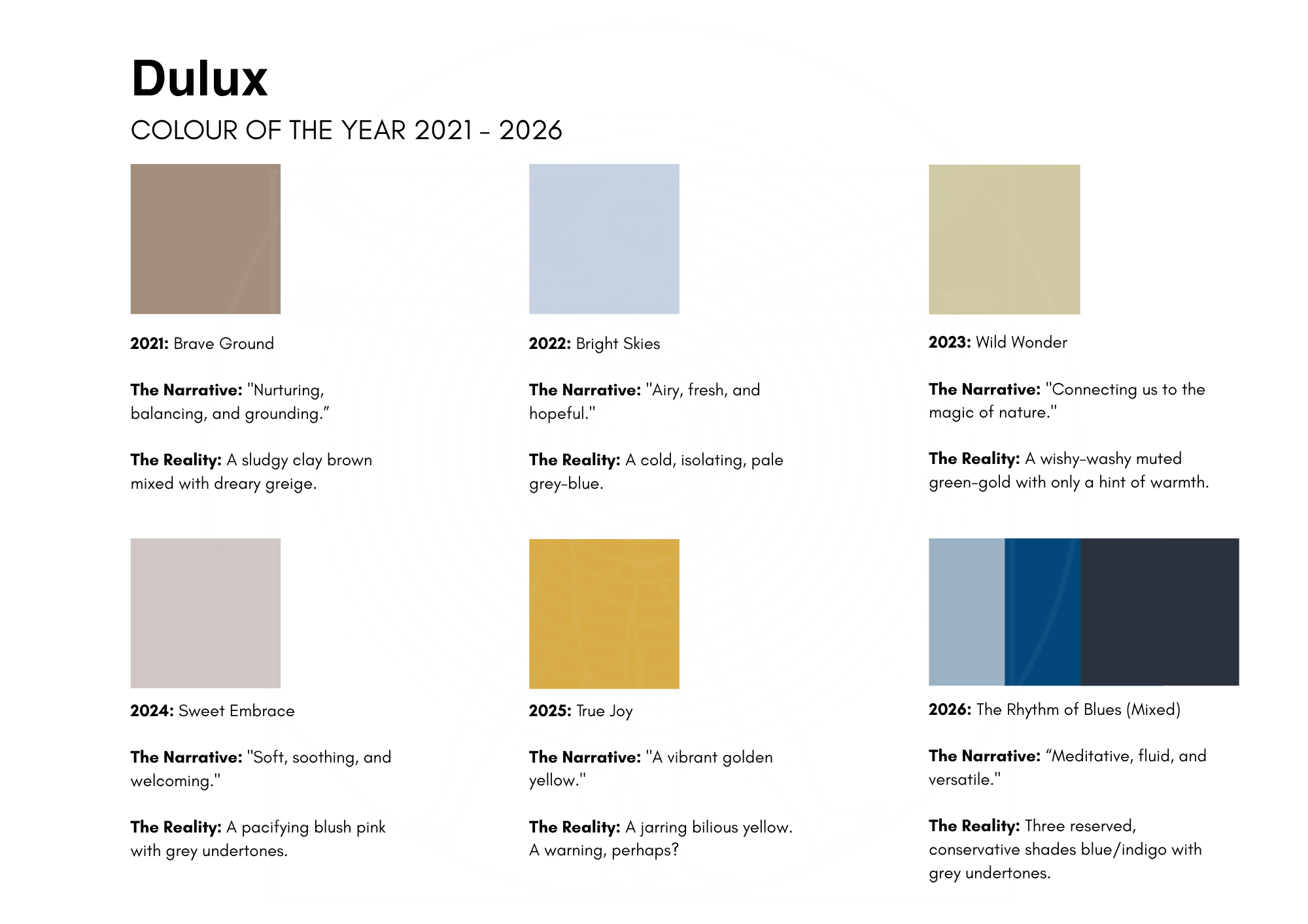
Dulux takes a covert approach to lull us into a false sense of emotional safety. Soft (weak?) muted tones are disguised as “therapeutic” but I would argue that energetically these hues at best induce passivity, at worst, apathy.
2025’s True Joy is the glitch in the chromatic matrix. This unexpected (and slightly nauseating) burst of mustard yellow gave an illusion of joy, a false sense of optimism, that allowed us to feel like things were progressing positively so that we didn’t ask too many questions. Then we were shot with a triple dose tranquiliser again in 2026 courtesy of not one but three shades of grey-based indigo.
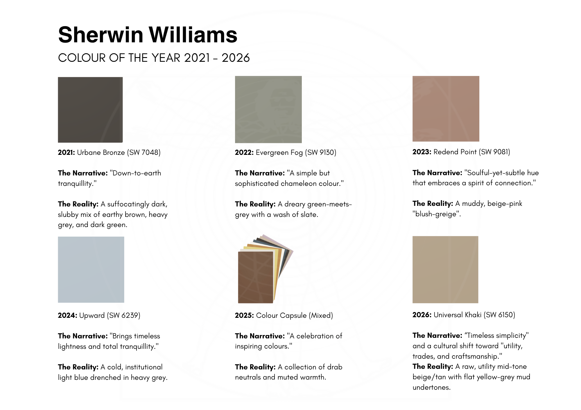
If Dulux is the European carrot, then Sherwin Williams is the stateside stick. In true American style they are not being even remotely subtle lol. The COTY palette over the last 5 years screams compliance. Using heavy, utilitarian greiges, bronzes, and khakis to forcefully ground and desensitise, it’s neutralised to the point of asphyxiation.
At this point they aren’t selling paint, they are unapologetically getting you to turn your home into your very own sensory deprivation bunker!
Synchronised Submission
For 2027, both brands have chosen shades of green that ordinarily could be considered restful and harmonious. I do like Dulux’s Soulful Sage—this particular tone is my preferred choice for a bathroom, where it inspires healing—but as a colour of the year it’s lifeless.
Sherwin Williams’ choice is even worse. I mean, it’s called Celery, for fuck’s sake. It’s been marketed as “an airy, herbal green” that “feels like a quiet reset”.
But think about the name: celery. Celery is a negative-calorie vegetable, meaning that it takes more energy to digest the damn thing than it gives you. Instead of being “restorative” this green will drain your active energy, ensuring you stay down, shut up, and don’t react. And don’t even get me started on the liminal space vibes it’s giving. Jeez.
Fade to black…
They call it “tranquility”. They call it “creating a sanctuary”. Over the last few years we have been systematically painted into a corner of complacency under the guise of “wellness”.
But the truth is we are done with the bullshit. More of us are waking up, escaping the system, and saying a loud “fuck you” to the institutions that try to control us. It’s not the time for quiet anything. It’s time to fight back, to stop censoring ourselves and say exactly how we feel.
Colour is how we do that. It is the language of self-expression, not submission. Trends keep us trapped, but making our own colour choices—ones that empower us, energise us, and make us happy—is how we break free.
The next time you walk into a DIY store and find yourself staring at 50 shades of greige, remember that you aren't just choosing an aesthetic. You’re choosing your level of sedation.
So, for the love of God and the future of humanity, step away from the sage. Chuck out the celery (no one likes it anyway). If you want to rebel against a world that wants you compliant, the most radical thing you can do is sack off the safe and boldly go into 2027 with colour confidence.
Kx
PS. I’m hoping Pantone has the balls to go for something a little more shocking when it announces its 2027 COTY in early December. But I won’t hold my breath!
I’m an artist, colour frequency specialist, founder of Chromagik, and creatrix of Hue-man Design™ —the colour-based system that reveals your unique energetic patterns so you can reclaim your soul identity and manifest the life you’re actually here for.