

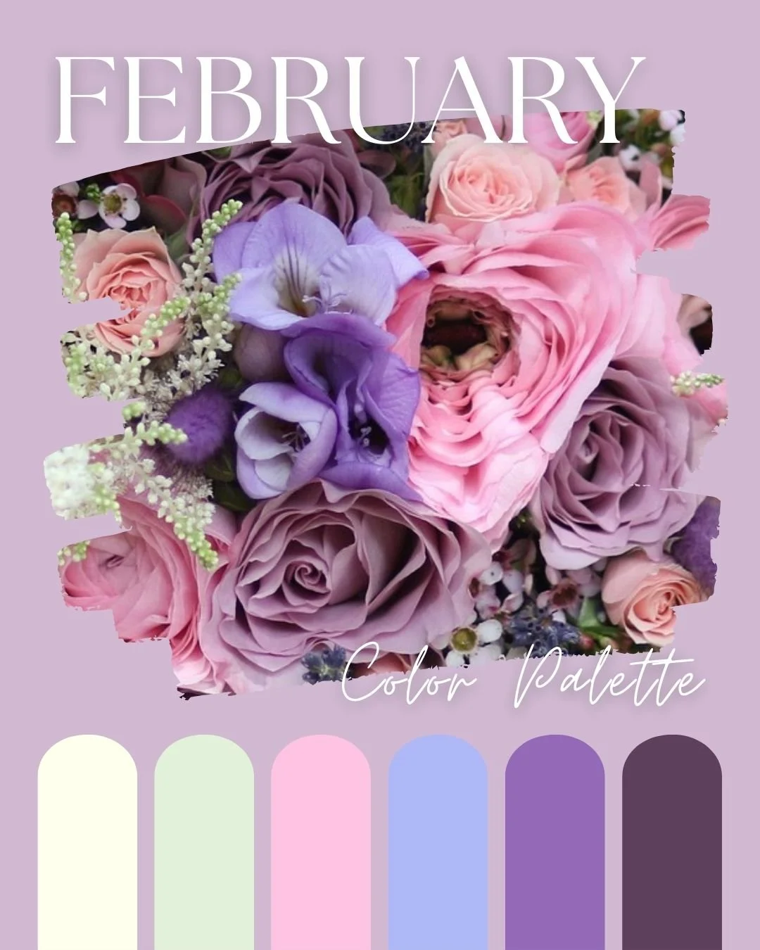
Love Is In The Air: February’s Feminine Color Palette
Fall head over heels with these romantic hues.
©Chromagik2025
Ahh, the power of marketing.
I bet you assumed the color palette for this month would include bright red and black, as retailers of cards, gifts and general Valentine’s Day tack would have you believe, right?
But these are the colors of seduction, lust and passion, not true, enduring love.
In my bonkers synesthesia brain, February always appears as a sort of mauve or violet color (perhaps because at some point I learned that amethyst is the birthstone for this month and it got lodged in my subconscious).
I’ve put together this divine feminine color palette to inspire you to embrace compassion and spiritual connection, whether that’s with your partner, your BFFs, or most importantly, yourself.
There’s a somewhat wistful, yet wildly romantic vibe about this palette, It’s feminine but not girly. It’s mature and strong yet soft and tender. The words ‘faded elegance’ come to mind.
Wanna go deeper? Let’s break it down:
Off-White: Preparation
Less harsh than bright white, off-white is delicate and elegant. It’s refined and non-judgmental.
In color therapy, off-white clears away emotional clutter, making space for authentic connection.
Although Spring is just around the corner, this color reminds us that we’re still hanging on to winter.
Pale Green: Serenity
Pale green is the color equivalent of a deep inhale and a refreshing exhale. It soothes the nervous system, encourages balance, and promotes emotional healing.
In color psychology, green is linked to the heart chakra, making it the ultimate color for love—not the dramatic, cinematic kind, but the everyday, nurturing, steady kind.
It brings harmony to all relationships.
Cornflower Blue: Trust
Relationships built on trust not lust, are the ones that endure. There’s nothing more romantic than feeling truly understood, and cornflower blue is here to help with that.
This calm, airy shade is linked to honest self-expression and emotional clarity.
In color therapy, it’s used to open up the throat chakra, helping you speak your truth without fear.
Cornflower blue also instils loyalty.
Dusky Pink: Affection
This soothing hue is not just for girls! Dusky pink is usually considered feminine, sure, but it’s also the color of universal love. So let’s be woke and say it’s gender-non-specific.
It’s the color of gentle affection, kindness, and compassion. There’s no drama with this color, it’s all about parity and inclusivity.
In color therapy, dusky pink is all about softening barriers and inviting tenderness into your life.
Mauve: Wisdom
Mauve is like the wise old grandma of the color spectrum—intuitive, introspective, and a little bit psychic.
It carries the nurturing energy of pink but with a bit more mystery. Mauve encourages reflection, making it the perfect shade for some self-discovery.
In color therapy, it’s great for inspiring creativity and innovation.
Aubergine: Devotion
Dark, rich, and a little bit dramatic, aubergine adds depth to this palette. It’s the color of lasting passion—the kind that transcends the physical and connects souls on a spiritual level.
It’s connected to intuition, devotion, and emotional intensity.
In color psychology, this deep shade of purple is associated with sophistication and luxury - who doesn’t love being spoilt every now and then?!
• • •
So, as February unfolds, forget the clichés and lean into love that’s real—love that soothes, strengthens, and sustains. Whether you’re focusing on romantic love, deep friendships, or self-compassion, these colors will help set the vibe.
Surround yourself with them, wear them, meditate with them—let them remind you that love is more than a cheap card and a box of choccies*. It’s the foundation of everything.
That’s way more sexy.
*wouldn’t turn them down though, obvs!