

An Introvert’s Guide To Colour Confidence
Colour doesn’t have to scream attention. Here’s how you can use it quietly.
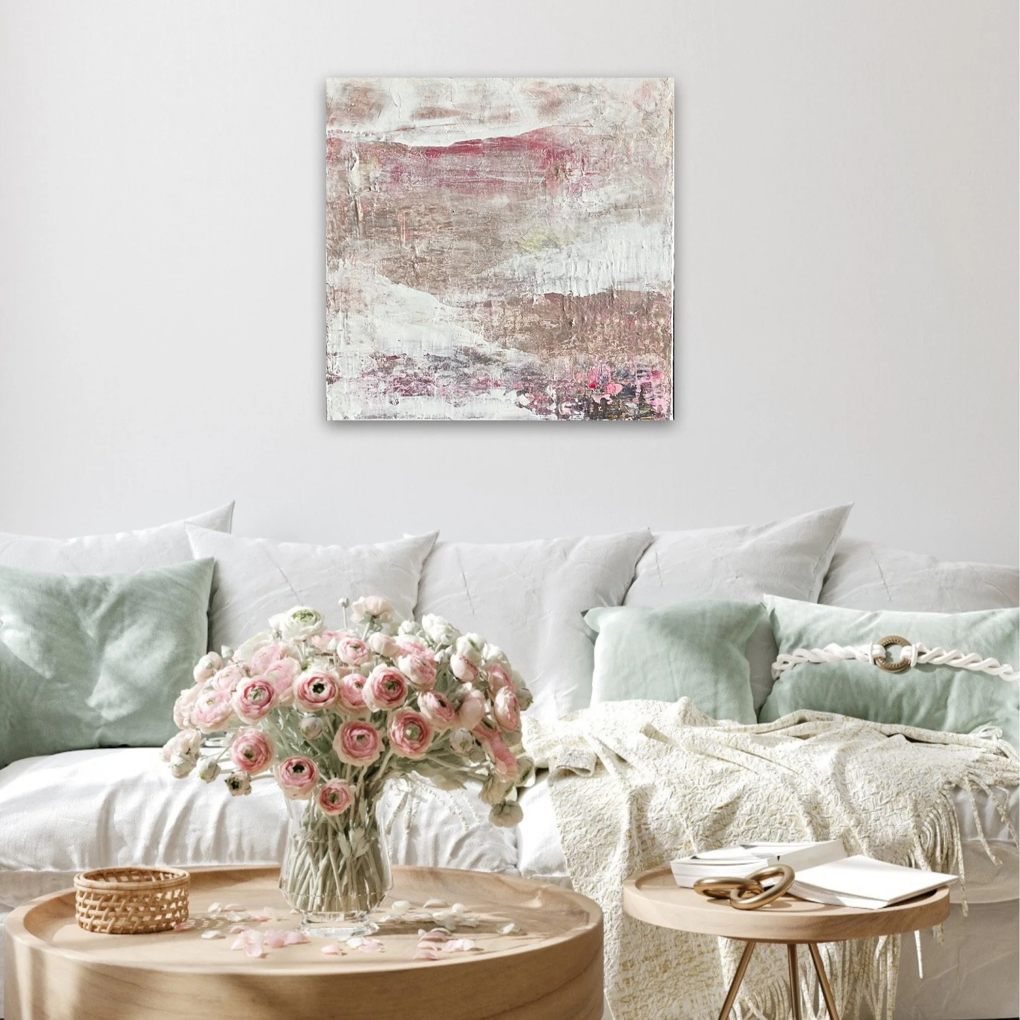
My preferred palette for painting is soft greens, pale pinks and beige. ©KerryHussain2025
“I’m not good with colour.”
This (or some version of it) has been coming up a lot lately among my Substack readers.
Here’s another:
“I look in my closet and see only a couple rays of color mixed in to blackness…”
Sound familiar?
If that’s you, I’m here to tell you that’s ok. I was the same until I realised colour is not just about what we see, but how we feel.
The Chromagik philosophy is that you don’t have to go colour crazy to be colour conscious. It’s about the right colours, not only bright colours.
Colour doesn’t always have to shout. It can whisper.
So if you’ve been telling yourself that you’re “not good with colour,” what you probably mean is:
• You’re overwhelmed or overstimulated by too much vibrant colour (me!)
• You associate colour with a boldness you don’t resonate with (also me!)
• Or maybe you’ve just never thought of subtle shades as real colours (and again)
Let’s get one thing straight shall we?
You Don’t Need to Be Loud to Be Powerful
A lot of people assume colour = bright, bold and brash.
But that’s like saying you can only be heard if you shout. Sometimes a gentle, steady voice can be just as (if not more) powerful.
Colour isn’t just all hot pinks and neon brights.
Beige is a colour. So is taupe. So is cream, peach, almond, blush, sage… you get the idea.
Neutral tones are still colours. Muted colours are still colours.
And they’re powerful in their own right.
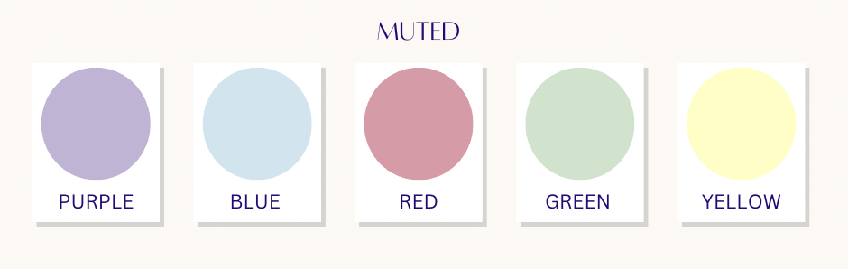
Muted colours are still colours!
Quiet colours hold their own energy. They’re soothing, grounding, even healing. Imagine soft white sand, early morning mist, a warm cup of creamy chai. That’s still colour. Still emotion. Still energy.
Taupe isn’t boring—it’s comforting. It brings stability.
Beige isn’t bland—it’s versatile. It encourages adapability.
Cream isn’t basic—it’s reassuring. It invites relaxation.
These “unassuming” shades are perfect for manifestation work, especially if you’re trying to:
Calm your nervous system
Create a sense of peace and safety
Ground your energy after chaos or burnout
Tap into gentle, receptive receiving energy
Build a stable foundation for the next big thing
You can still manifest like a mofo with muted colours. You don’t have to dress like a clown on acid or decorate your home like Willy Wonka to start working with colour. Cos I sure AF am not!
Find your colour ‘set-point’
I love neons and bright shades. But I can’t handle them in large doses.
My base colours are neutrals—taupe is a particular favourite—along with pale pinks and soft greens. These are the shades that keep me in homeostasis, balancing and regulating my nervous system.
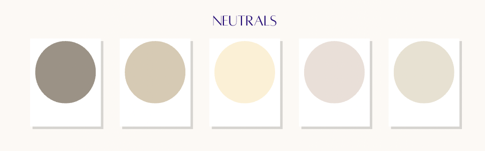
Shades of beige
I use these as the backdrop for small pops of vibrant colour to evoke certain feelings. I also bring in other colours temporarily depending on what I’m manifesting so that I can connect with that energy.
When I curate colour palettes for my Quantum Colour Kickstarter clients, I always show your bespoke colours in four different categories: Vibrant, warm, cool and muted.
This way you can choose the shades that suit you while still benefitting from the energy of the colour.
Finding your natural colour set-point will provide a good starting point and act as a foil for others. Look at the colours around you in your home and your wardrobe.
Think about colours you’re automatically drawn to and how they make you feel.
Colour Is a Language—But You Don’t Need to Be Fluent
You don’t need to “get it right.” You don’t need an art degree (I don’t have one).
Colour is intuitive. It speaks directly to the subconscious, and the subconscious doesn’t care if you’ve memorised the colour wheel.
It just responds.
So whether you’re drawn to buttery yellow, pale terracotta, soft mauve, or an entire spectrum of greige—you're already doing colour.
But that’s just the beginning. The next step is to get intentional but I’ll cover that in another post.
Fade to black…
If you think you’re “not good with colour”, I invite you to reframe it like this:
“I use colour in a way that feels good to me.”
Because colour isn’t about being loud. It’s about being in alignment. And sometimes, alignment looks like soft taupe, natural stone, and dove grey.
So go ahead. Start there. You don’t have to be an extrovert to manifest with colour.
You just have to be hue-man.