

An Earthy Awakening: Spring Color Palette
March is a transition phase—this spring color palette has got you.
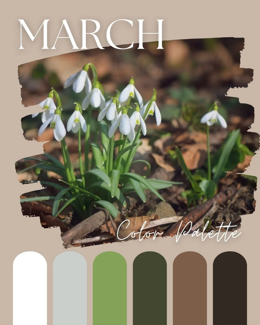
©Chromagik2025
Hooray! March is here again, and with it comes all the colour!
It’s my most favourite month of the year—I bloody love it! Everything is waking up, the days are getting longer, and there’s a whiff of optimism in the air. People are happy again.
And March just so happens to be the month of colour.
Holi, the Hindu festival where everyone chucks coloured powder at each other and generally has a right laugh, falls on the 14th, and International Colour Day comes the day after the Spring Equinox on the 21st.
And because I’m all about using colour to shift energy and set the vibe, I’ve put together a colour palette that captures the mood of March.
The transition from February (with it’s drab skies and rain) to March (with it’s sunshine and flowers) is akin to when Dorothy goes from Kansas to Oz—suddenly everything is ALIVE.
It can be a bit of a shock to the system but this palette will make it seamless.
You were probably expecting to see daffodil yellow or maybe some sky blue but you should know by now that I don’t like to state the obvious.
In my synesthesia brain, March is a kind of mushroomy brown and this palette represents growth and renewal.
It’s the time for a fresh starts and earthy awakenings.
Let’s get into it..
White – The Blank Slate
White is the ultimate fresh start. It’s crisp, clean, and carries the energy of possibility. In colour therapy, white represents innocence, purity, and new beginnings.
After the heaviness of winter, white comes swooshing in to clear the decks.
It’s like hitting the factory reset button—it offers the chance for a complete do-over and makes space for whatever comes next.
If you’re feeling a little stuck, overwhelmed, or just need to declutter your brain (and maybe your closet), white is your go-to energy cleanser.
Soft Grey – The Transition
This pale grey (with ever so subtle green undertones), is the perfect in-between shade to ease you from winter into spring. It’s gentle, reassuring, and is in no hurry.
In colour psychology, grey symbolises neutrality—it’s neither too dark nor too light, making it a fantastic balancing shade.
Just like the climate in March, grey can be a little indecisive— one day it’s snowing, the next it’s t-shirt weather—but this colour has got your back whichever side of the fence you choose (or even if you sit on it).
Apple Green – The Growth Spurt
Apple green epitomises that first pop of spring energy. It’s the colour of new growth emerging from the darkness, with a fresh perspective and youthful enthusiasm that wants to explore everything all at once.
In colour therapy, green is all about renewal, abundance and harmony.
This shade of green, in particular, is uplifting and revitalising—it’ll help you shake off winter and prepare you for new opportunities.
If you’re ready to plant new seeds (literally or metaphorically), this is your colour.
Dark Olive Green – The Steady Eddie
If apple green is the excitable new kid on the block, dark olive green is the wise old oak making sure you don’t run off into the road and get squished.
It’s rich yet reserved, it’s full of knowledge yet somewhat enigmatic. This is the colour of adaptability, endurance, and deep healing.
Psychologically speaking, dark green tones help with stability and connection to nature.
March isn’t just about reaching for the stars—it’s about strengthening your foundation, so whatever you’re starting has a solid base to stand on.
When you’re ready to start climbing, dark olive green will be holding the the ladder.
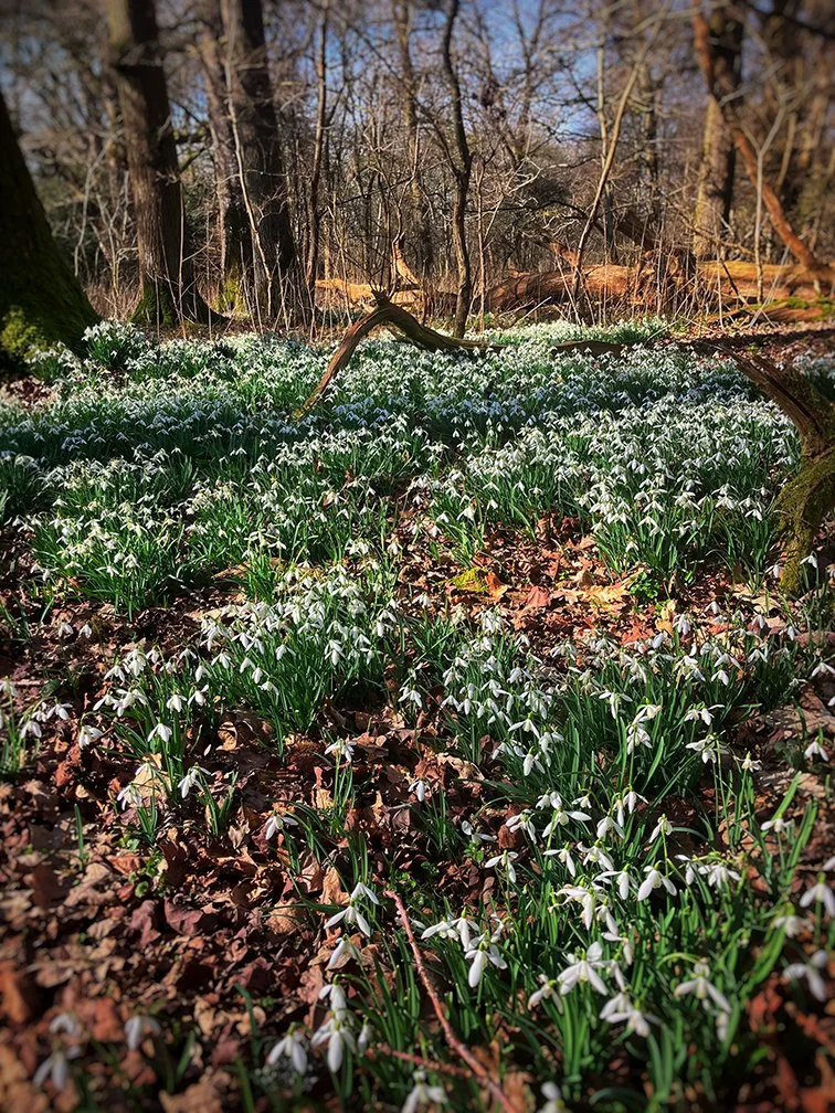
Photo ©KerryHussain2025
Taupe – The Natural Neutral
Taupe is that soft, earthy shade of mushroomy brown that ties everything together. It’s strong without being overpowering, and subtle but interesting.
In colour psychology, taupe and soft brown shades symbolise stability, reliability, and a sense of home. They bring a feeling of comfort and safety.
There’s still a bit of a nip in the air in March, even when the sun is out, and this warm neutral shade is like a cosy blanket around your shoulders.
If your energy has been all over the place lately, taupe will help bring you back to centre.
Brown – The Strong One
Brown is as real as it gets. It’s steady, strong, and deeply connected to nature.
In colour therapy, brown represents security, dependability, and being present in the moment. It reminds us to slow down, trust the process, and embrace the natural cycles of life.
Despite its inherent strength, brown is quietly nurturing.
If you need a reminder that growth isn’t instant (but it’s always happening), let brown be your grounding force.
Embracing the March Mood
March is all about fresh starts, but it’s not a frantic, chaotic energy—it’s a gentle awakening.
This is a palette to bridge the gap between winter and summer—it coaxes you out of the cave without getting in your face.
Use this colour palette to guide your energy: let white and pale grey clear the way, apple green spark new life, dark olive green keep you safe, and earthy taupes and browns keep you grounded.
Slow but steady is the name of the game this month.