

A Deep Summer Colour Palette That’s All The Raj!
July’s energy is rich and radiant!
There’s a special kind of magic in the air in July.
Yes, it’s peak wedding season but I’m thinking of a different sort of romance—the kind of old movies, history and faded grandeur.
This is the month where heat of summer makes everything slow down, but in a good way. You’re being invited to savour the moment, take your time, and really soak up the beauty around you whilst staying in your power.
In my head July is raspberry pink, a colour that also immediately transports me to Rajasthan in India, and this is the inspiration for this month’s colour palette.
Imagine the crumbling, rose-coloured palaces of Jaipur, aka the Pink City. That soft, weathered beauty, contrasted with the vibrant swish of red saris, as women carrying golden water pots that glint in the hot desert sun saunter through the dusty streets.
Ahhhh, take me there now! There’s something so wildly romantic about it, right? That’s exactly the mood I wanted to capture with July’s palette.
Raspberry, coral, sand, carmine, and mustard—these colours are rich, radiant, and yet completely grounding.
Each has its own gorgeous energy and meaning so let’s get into it.
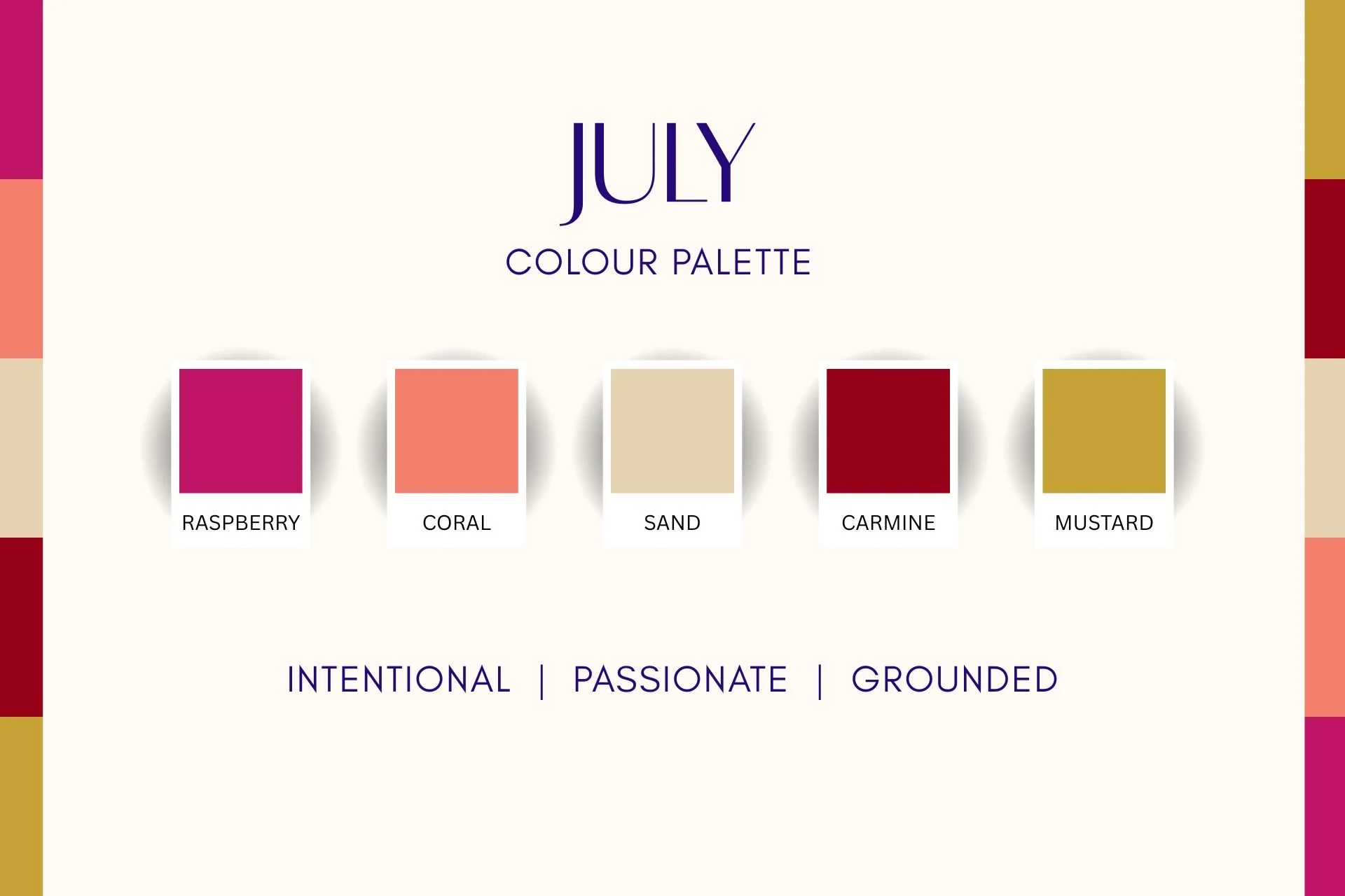
Raspberry
Mmmm yummy! This one is juicy. It’s hot, exciting, and a little bit risqué—the kind of colour that feels like bunking off work for the afternoon to go meet that guy from the bar you’ve been texting.
Raspberry is all about releasing old emotional patterns. It symbolises transformation and is a wonderful colour for giving you a loving push towards turning your dreams into reality.
It sparks creativity and innovation so if you’re stuck on a particular problem, Raspberry will help you solve it through playful exploration. It’s like your personal cheerleader, encouraging you to savour the sweetness of life and go after what you want.
This month, Raspberry is your reminder to do what makes you feel good—whether that’s painting, cooking, dancing, or just lounging around—and to do it guilt-free!
Coral
Coral is like a hug from a bestie in colour form. It’s soft, warm, and instantly uplifting.
Like Raspberry, Coral is linked to emotional healing, but more around fears or social anxiety. It gently encourages you to open up, to let people in, and to feel safe doing so.
Coral can sometimes be seen as a little immature but that’s part of its charm. It’s playful, but not overbearing—more of a soft nudge towards joy and togetherness.
This month, Coral is here to remind you to laugh more, connect with people, and find comfort in community—even if that’s just sitting the park chatting shit over a kombucha on a sunny afternoon.
Mustard
Mustard is a yellow I can actually get on board with. This is the Dijon kind, not the English Colman’s kind—it’s an honourable colour that is more reserved than its sunnier cousin. A muted gold, Mustard is warm, welcoming and earthy, and nods to a bygone era where material wealth was subtle not showy.
Mustard is an understated powerhouse—it brings clarity, focus, and confidence, but without forcing or rushing you. It helps you sort through your thoughts, clear mental clutter, and make wise decisions at your own pace.
It supports calm determination without tipping you into overthinking and anxiety. Mustard says, “You can do this, I’ve got your back.”
This month, lean into Mustard when you need clear, rational thought and to move forward with intention—no pressure, just quiet certainty.
Carmine
This rich, deep red instantly feels powerful and only a little bit dramatic.
Carmine connects you to your inner king or queen, it holds a regal energy that’ll make you feel unstoppable. It’s the colour of passion, courage, and deep-rooted vitality. It’s here to pump you up—but in a grounded, graceful way.
It stokes the fires of ambition and drive, helping you push past procrastination or that sluggish mid-year feeling.
This month, Carmine is your reminder to honour what lights you up. Follow your passion, but be intentional—there’s no need to go full pelt, slow and steady is Carmine’s mantra.
Sand
Finally we have Sand—a soft, beige that’s a respite from the searing heat. It’s the gentle neutral that balances the energy.
Sand is all about stability and relaxation. It soothes the nervous system and keeps you comfortable while maintaining an air of refined quality.
Among the other bold and somewhat decadent colours in July’s palette, Sand offers a mature, sensible middle ground.
This month, Sand invites you to slow down and settle into what feels real and solid. Let it be your anchor while you enjoy the other riches this palette has to offer.
So, what’s the overall vibe for July?
In a word: regal. These colours are about leading with a strength that is bold and fearless.
July’s palette is here to remind you of your own sovereignty and to keep moving forward with courage but in a deliberate and considered way.
Keep your head held high and your feet on the ground this month and you’ll reign supreme—just like the Kings of old!